~Benny Fulmer's~
PORTFOLIO WEBSITE PROJECT
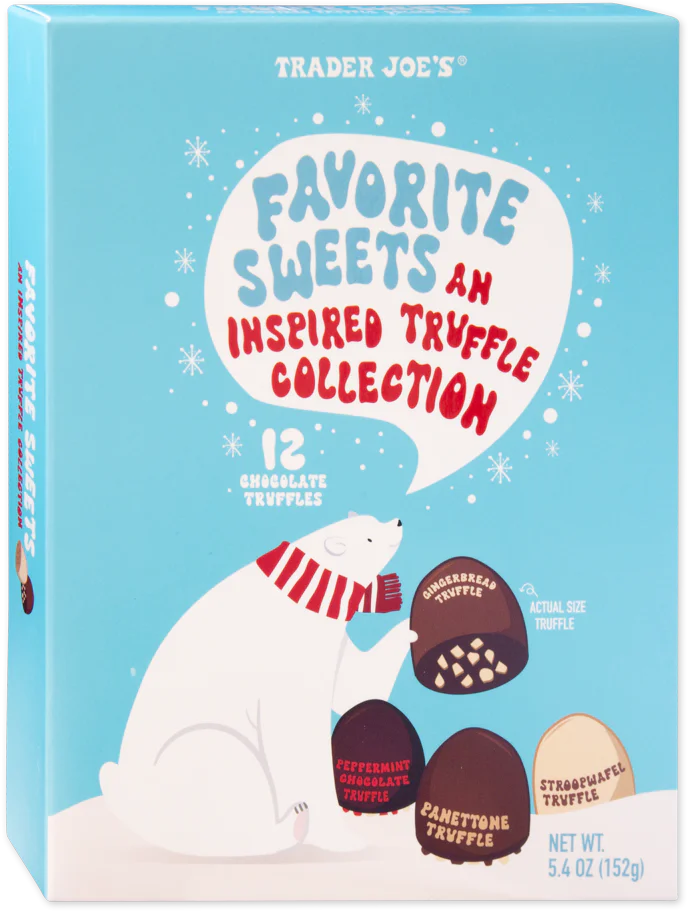
GOALS
For this project, I chose the product "Favorite Sweets - Inspired Truffle Collection", by Trader Joe's. My family usually gets something like this every year around Christmastime, so it seemed like a good choice, and the box has very strong graphic design for me to base the website around. Since the bear is so cute, I'm thinking about making the site family- or even child-oriented.
SCREENSHOTS
All of the examples I chose were from searching "Christmas" on Awwwards.
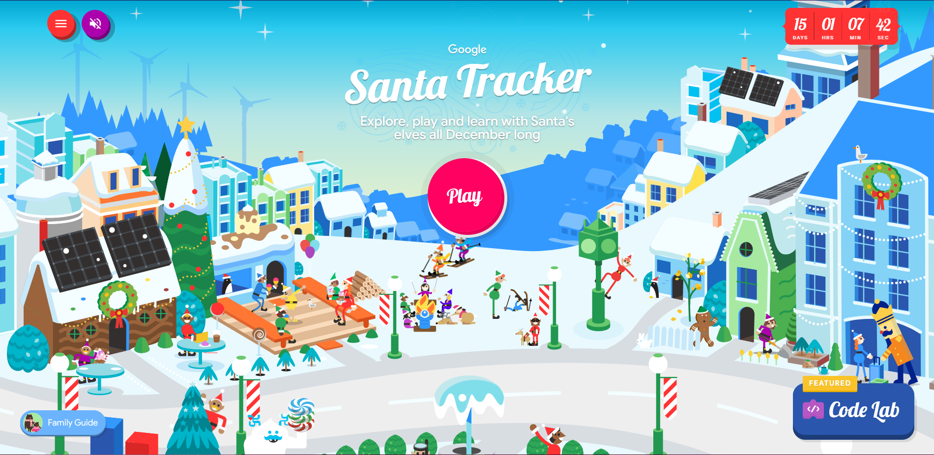 https://santatracker.google.com/
This classic site has a similar palette to what I'm going for, albeit much more complex.
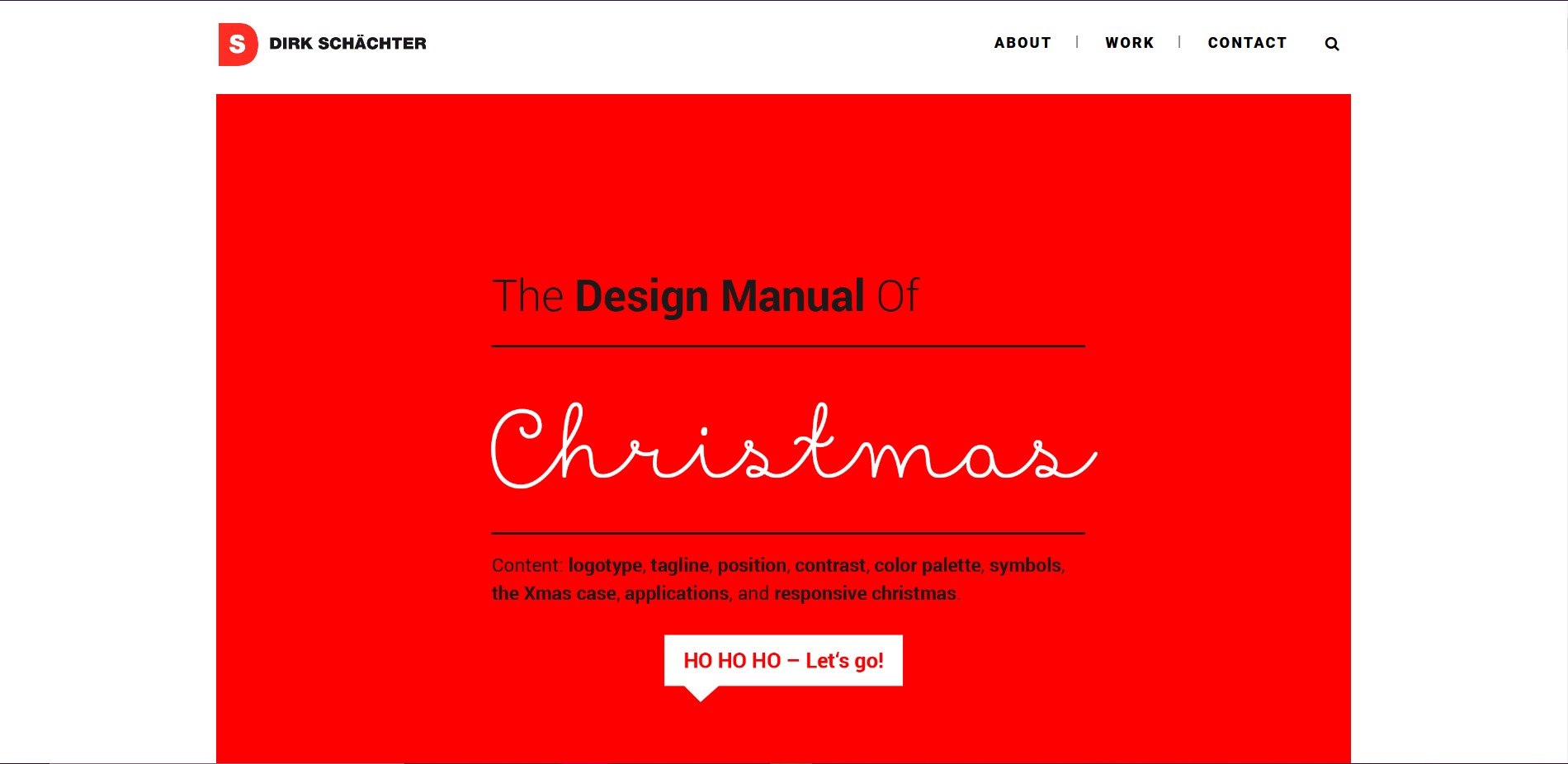 https://ds03.de/portfolio_page/design-manual-of-christmas/
In addition to having a centrally located container, which I'll also be using, there's a lot of good tongue-in-cheek advice about designing a Christmas-y website here.
 https://howgdprstolechristmas.com/
I want to do something vaguely similar to this page, using the snowy ground around the bear to help visually divide parts of the page.
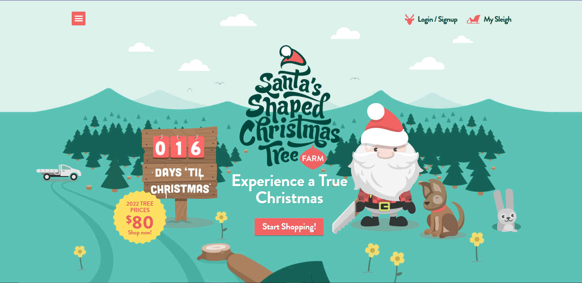 https://christmastrees.net.au/
While I don't plan to use any moving images in my work aside from a carousel, they're very effectively implemented here.
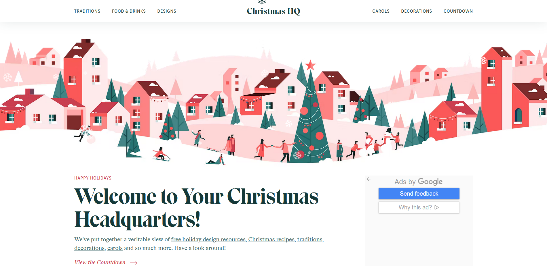 https://christmashq.com/
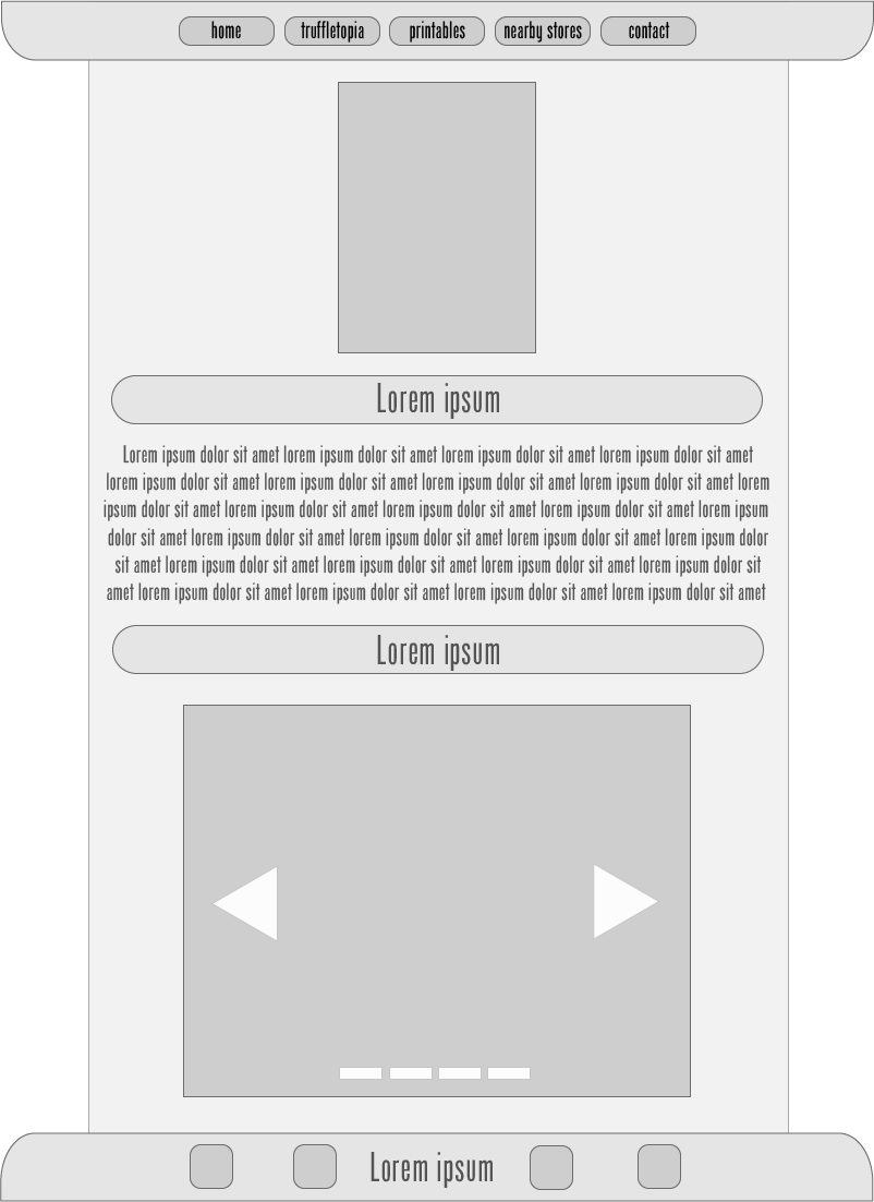
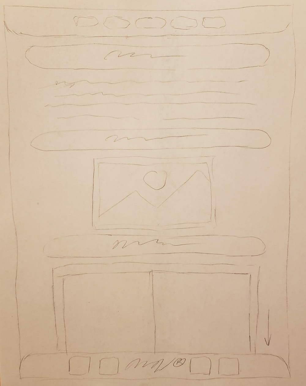
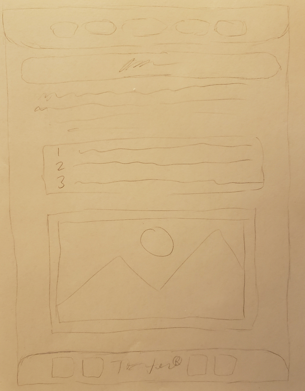
I like the navbar at the top, I may mirror it at the bottom in a footer.
NAVIGATION
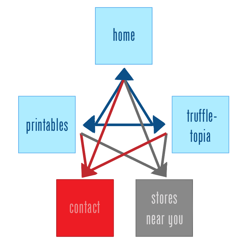
Obviously, the first button on the navbar will be "home", to keep it simple and easy to understand. Then, rather than including a recipe (these treats are already quite complete) or nutrition facts (spoiler alert: they're not the best for you), I thought it would be better to have one page dedicated to a board game, and another for printable content. This goes with the all-ages audience I'm aiming for. The last two buttons, which won't be populated with my content, will be for "stores near you" and a "contact" option. While the former will be grayed out and inaccessible, the latter could link to Trader Joes' official contact page, from their website.
SITEMAP
LAYOUTS
PALETTES
Created with Adobe Color:

